If you’re asking, “Is my website mobile friendly?”, then this guide can help.
The only way to get the answer is to run a mobile-friendly test. Below, you’ll find out how to check if a website is mobile friendly analyzing the mobile-friendliness with freely available tools for website optimization.
Use the methods on this page to quickly find out if your website is mobile friendly for users and search engine crawlers ,which are important factors for search engine optimization (SEO).

How to Check If a Website Is Mobile Friendly
1. Use Browser and Device Testing
The most straightforward way to check if your website is mobile friendly is to test it for any apparent responsive design issues that could impact mobile SEO by opening the site up on different devices and see how it looks.
First, you should load the website on a desktop computer and check it out on Chrome, Firefox, and Safari. Experiment with adjusting the browser size by dragging the right size of the pane to the left until it represents the size of a mobile device. This will let you test how your site adapts to the various CSS media queries for screen size.
As you can see in the image below, the SEO Chatter website responds nicely to mobile screen sizes; the mobile menu appears and the content scales down to fit the screen without any issues.

You can then repeat this process on any smartphone or tablet device you have to confirm everything check outs. Test the site on mobile browsers, and remember to also test both horizontal and vertical screen orientations to check for mobile-friendliness.
If you have a mobile-friendly site, you’ll see all of your content and features with no need for zooming or horizontal scrolling on a mobile device or desktop computer. But, if the website is not entirely mobile-friendly, then your site won’t rearrange to suit the resized browser window, meaning it’s time to take action to fix the responsive design.
2. Use Chrome and Firefox Developer Tools
Both Google Chrome and Mozilla Firefox have mobile testing features that allow you to check how your site looks and performs on mobile devices.
On Chrome, right-click on the page and choose Inspect as seen in the image below.

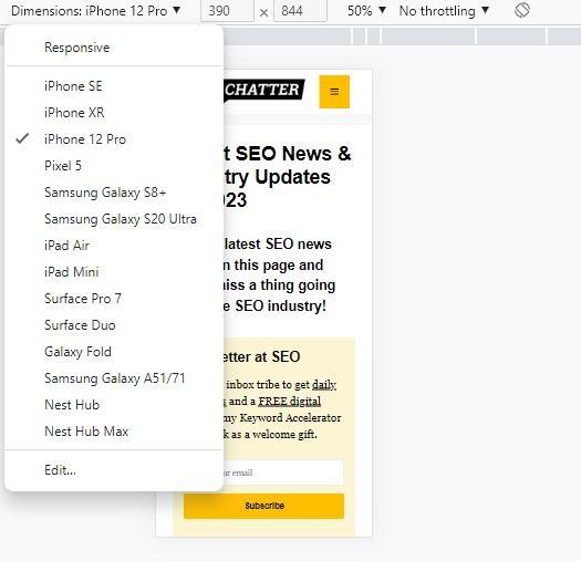
This step brings up the Chrome developer tools. Here, click on the icon that looks like two overlapping rectangles to the left of Elements to toggle on the device toolbar.

This step will scale your website down to a mobile friendly size. You can further test various popular smartphone devices by click on the Dimensions: Responsive drop-down menu and selecting the device you want to check for mobile-friendlines. See image below.
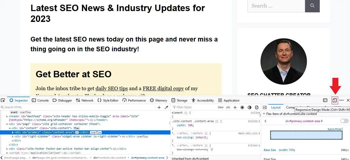
On Firefox, the process is pretty much the same. Right Click > Inspect > Responsive Design Mode.
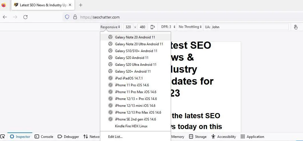
Again, this gives you a drop-down menu that you can use to test your website’s responsiveness on all kinds of different devices as seen in the image below.
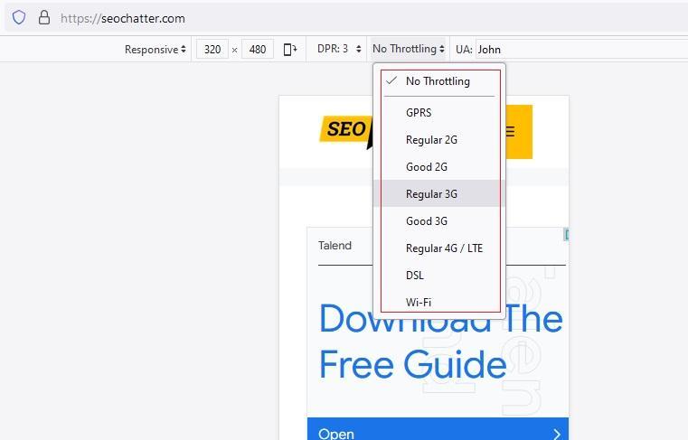
Firefox and Chrome Developer tools also give you the ability to test your site’s performance on multiple network speeds. This can be invaluable for helping you ensure consistent performance regardless of whether your mobile users are connected to WiFi or using their phone’s mobile data plan.
This mobile-friendliness feature can be checked by clicking on the No Throttling drop-down menu and choosing a network speed.
There’s also the option to explore different Device Pixel Ratio (DPR) settings and test your site in horizontal screen orientation without having to manually resize the browser. Click on the icon like you see in the image below.

Quick Tip: To save time, you can access Developer Tools on both Google Chrome and Mozilla Firefox by pressing CTRL + SHIFT + C on Windows and Cmd + SHIFT + C on macOS.
3. Use Google Mobile-Friendly Test
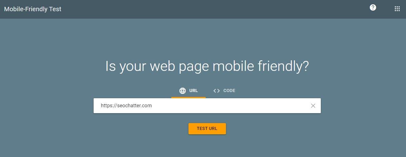
It’s no secret that Google considers mobile-friendliness as a key ranking factor. And the free mobile-friendly testing tool can let you quickly test whether Google views your site as fully responsive.
Visit search.google.com/test/mobile-friendly, then enter your website’s URL in the space provided, and tap Test URL. The image below shows how this step looks.
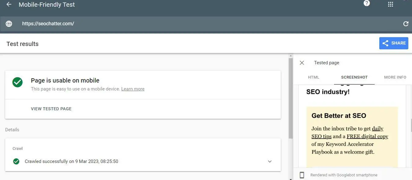
After a few moments, Google will verify whether your site is mobile-friendly. If it is, you’ll see a green checkmark with the words “Page is usable on mobile” like this:
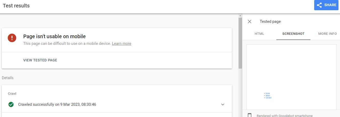
If it’s not, you’ll see a red warning icon with the words “Page isn’t usable on mobile” like you see in the image below.
4. Use Google Search Console
Google Search Console is an invaluable SEO tool for all sorts of reasons, especially because it can provide valuable insights into your site’s mobile usability. You’ll need your website connected to this free service to use this step to find out if your website is mobile friendly.
Open up Google Search Console and navigate tothe Page Experience tab as you can see in the image below.
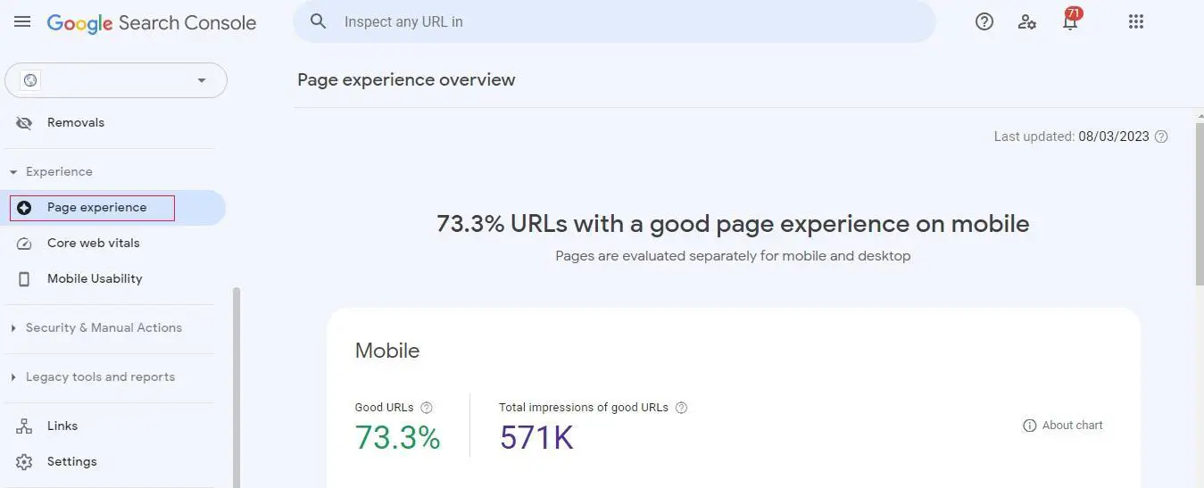
You’ll immediately be presented with an overview of how many pages on your site offer good user experiences on mobile devices. You can then tap Mobile Usability to gain more insights into your website’s mobile-friendliness.
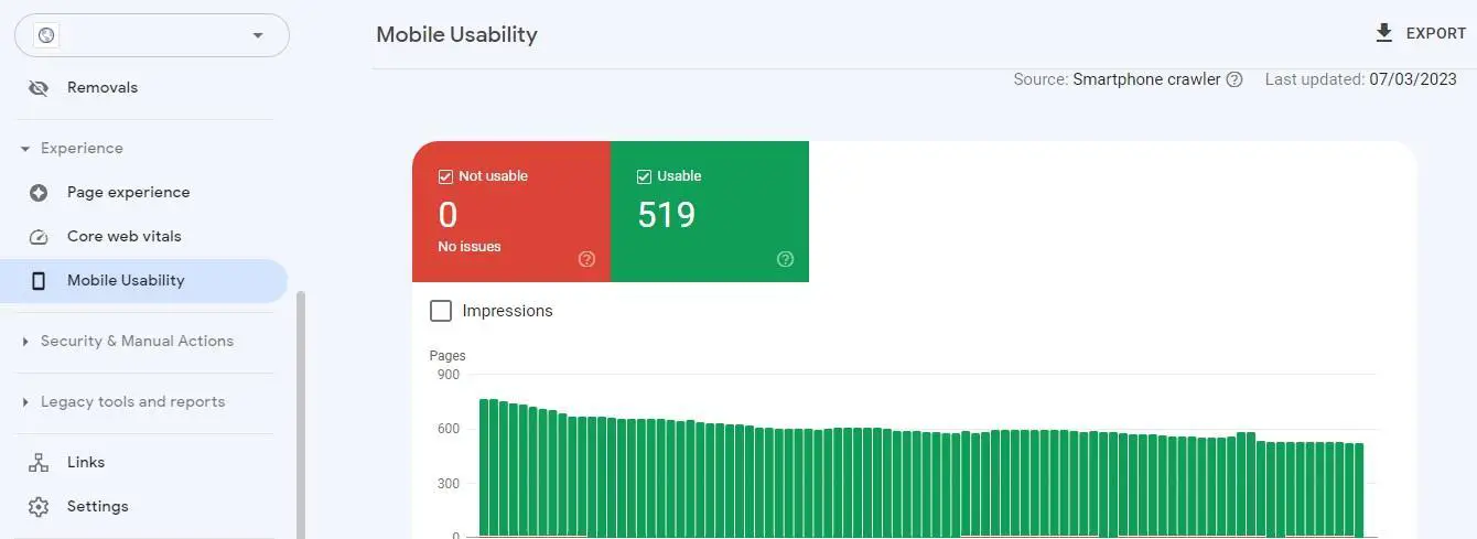
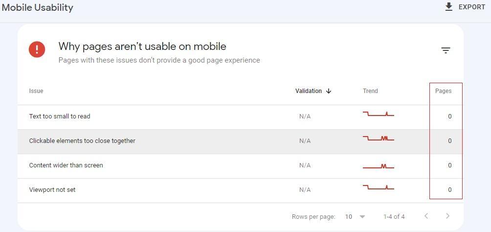
If there are any issues affecting mobile usability, you’ll find them at the bottom of this screen. Google Search Console will list all the problems and show you how many pages are affected by that problem.
As you can see in the image below, all of the web pages in this example are mobile-friendly, so Google Search Console shows zero affected pages for each problem, though yours may be different.
5. Use PageSpeed Insights to Test Performance
Design and functionality are not the only factors determining whether your website is mobile-friendly. Your pages could be responsive and look great on every device and browser, and all of the features could technically work, but if it takes forever to load, that will create a poor user experience.
The easiest way to test your site’s mobile performance is with Google’s PageSpeed Insights Tool. Open up the tool by going to pagespeed.web.dev/. Then, enter your URL and click Analyze.

Here, you’ll get a breakdown of important page speed data that make up what’s called Google Core Web Vitals as you can see in the following image.
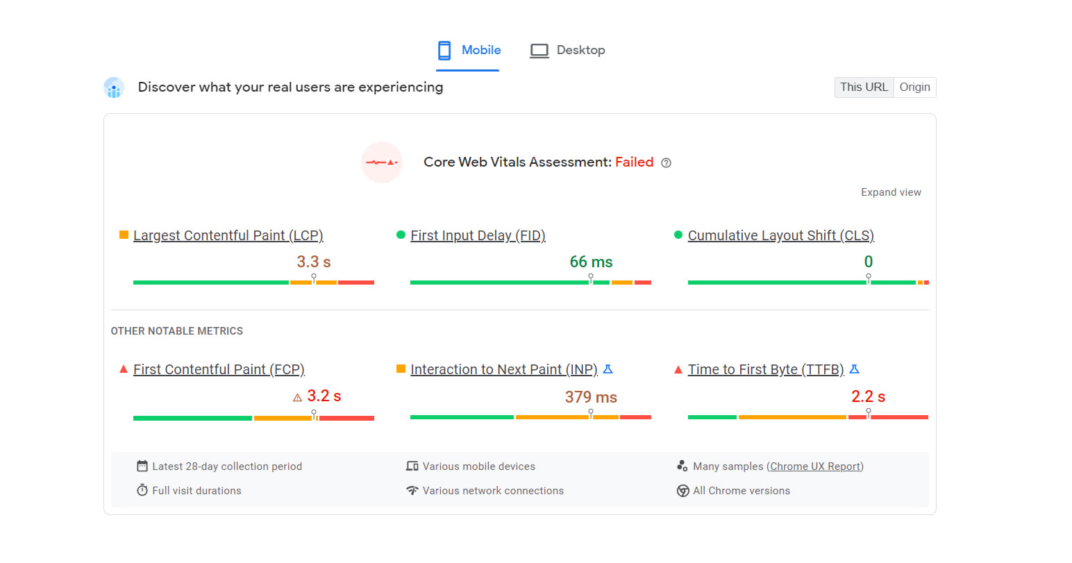
Factors such as Largest Contextual Paint (LCP), First Input Delay (FID), Cumulative Layout Shift (CLS), First Contextual Paint (FCP), Interaction to Next Paint (INP), and Time to First Byte (TTFB) all play a role in mobile speed performance.
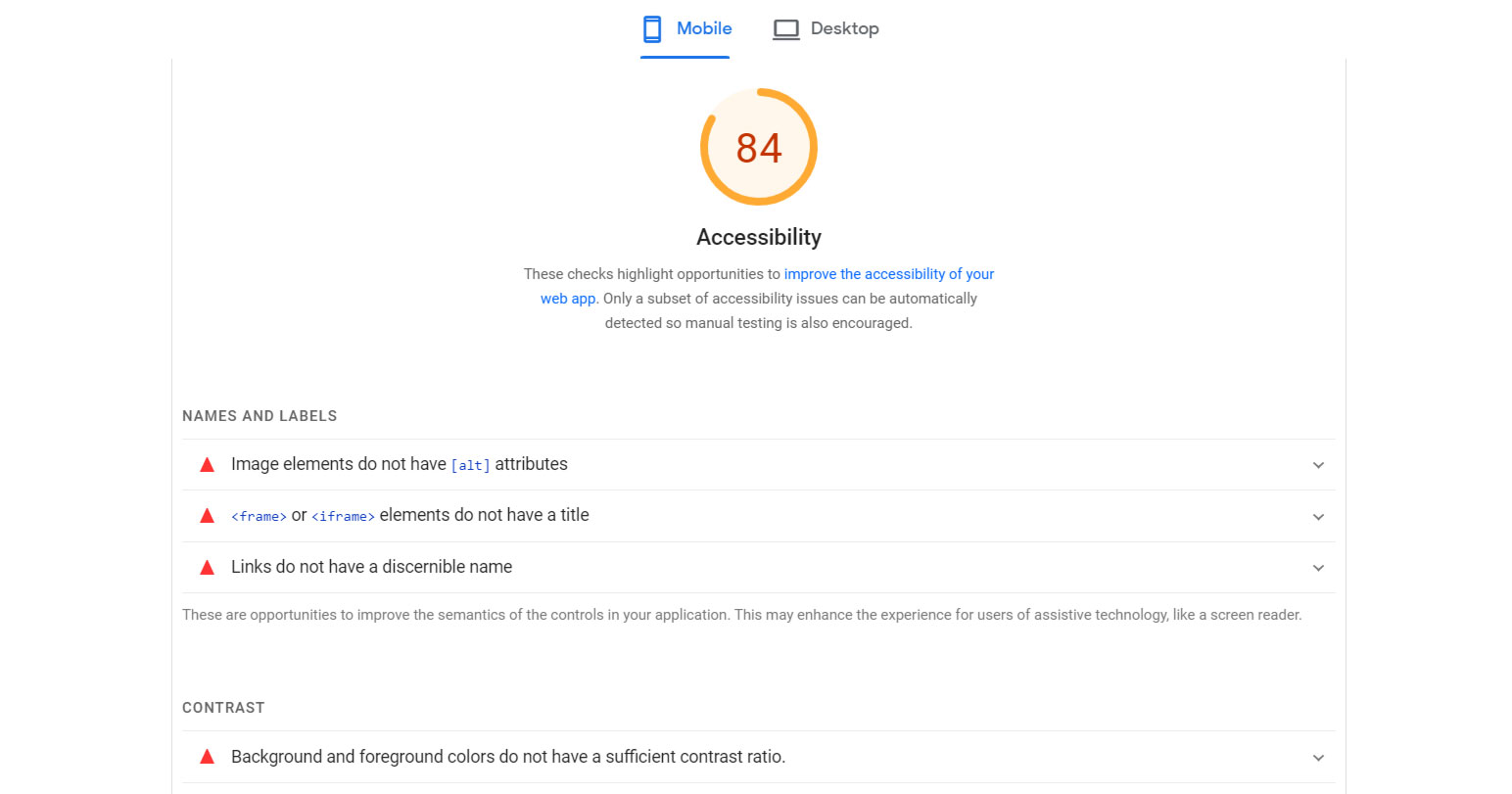
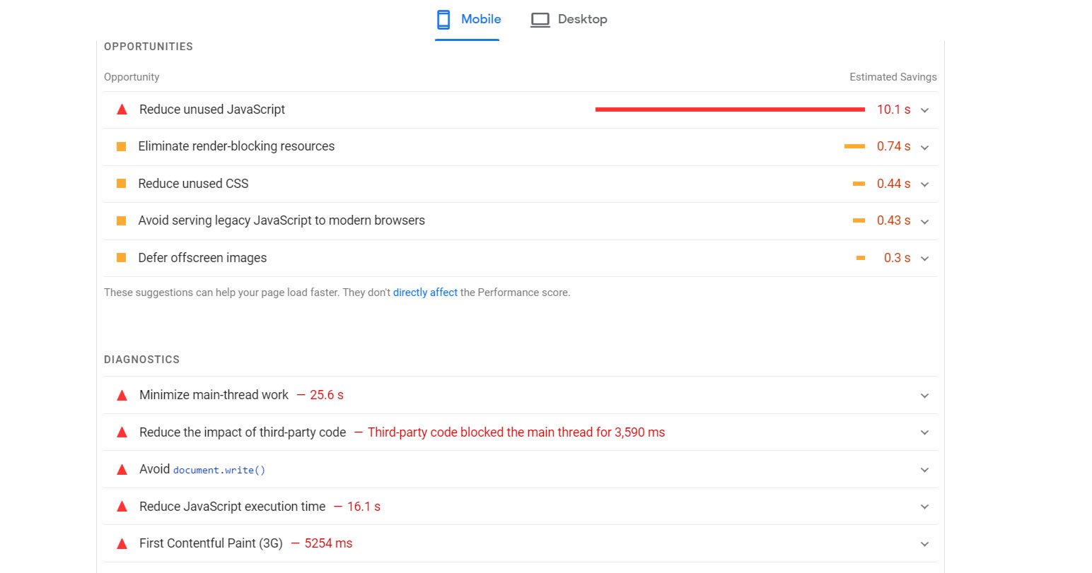
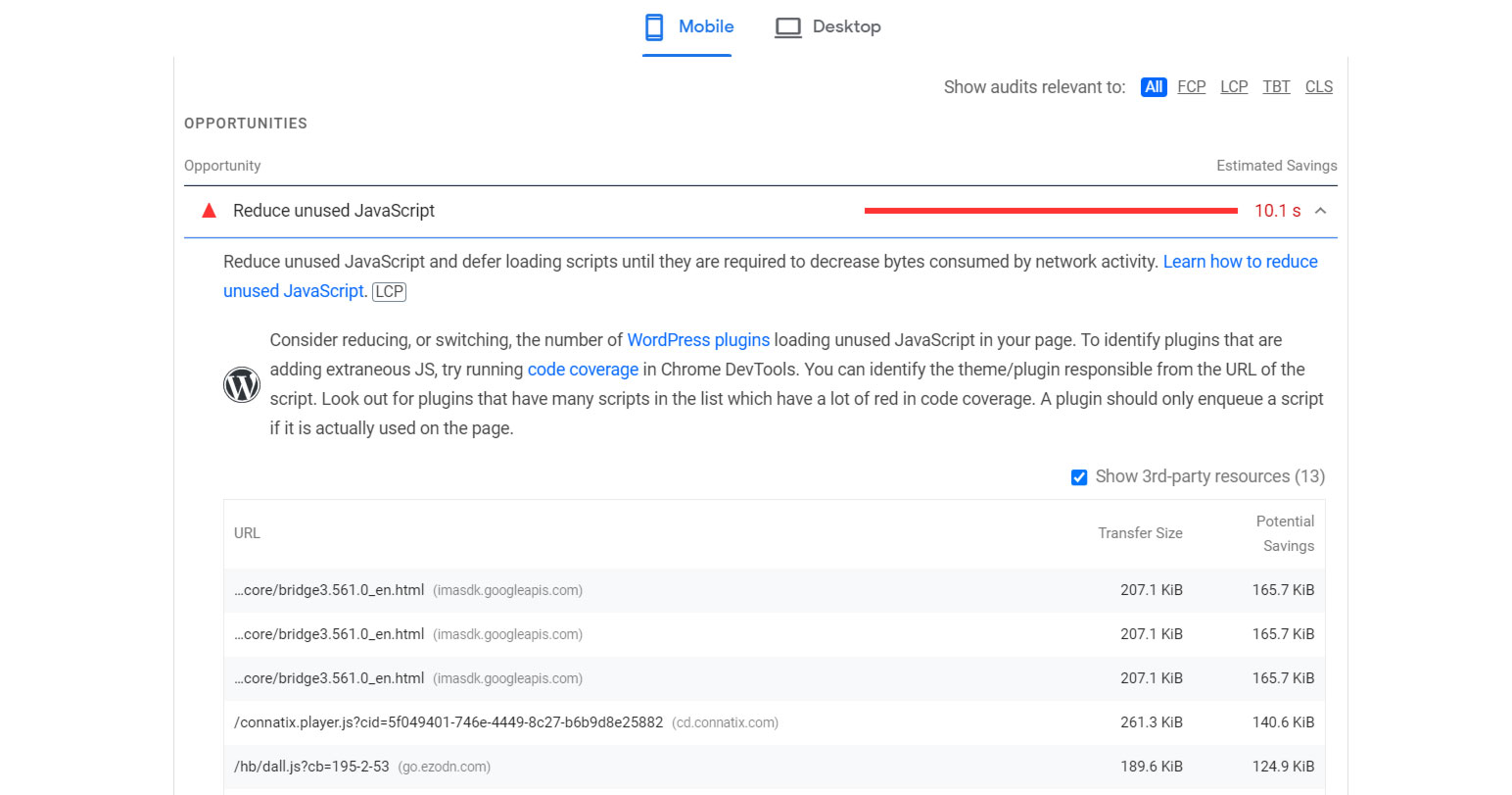
Fortutately, the Google PageSpeed Insights tool provides Opportunities and Diagnostics sections that reveal any problems or areas for improvement for mobile devices (and desktop). Perormance issues are also rated on a scale of 100 in critical areas such as Accessibility, Performance, Best Practices, and Search Engine Optimization.
Under each of these scores, you’ll see the list of issues preventing you from scoring a perfect 100. If your site isn’t performing as well as it should, navigate to Opportunities and click on each opportunity to reveal helpful suggestions and instructions on improving this area of your website.
Here’s an image with an example score for Accessiblity:
Here’s an example image showing the Opportunities and Diagnostics sections.
Website Mobile Friendly Check Summary
I hope you enjoyed this guide answering the question, “Is my website mobile friendly?”
As you discovered, there are four primary ways for how to check if a website is mobile friendly, including the manual browser and device testing, Chrome and Firefox developer tools, Google’s Mobile-Friendly testing tool, Search Console, and PageSpeed Insights; all of which are freely available methods for analyzing the mobile-friendliness for users and SEO.

SEO Chatter is dedicated to teaching the fundamentals of search engine marketing to help marketers understand how to increase organic website traffic and improve search engine rankings.